Portraits of Denim

Welcome to the wold of used denim as insulation! I believe GAP is doing some denim recycling program at the moment; bring in your old jeans to lead a new life as insulation, get a coupon for new GAP jeans. Well all that shredded, mashed up denim winds up looking like this.

Back at the Levi's building renovation, I was handed a block of denim insulation to photograph. I posed it amongst the steel beams that would eventually be enclosed inside office walls.

Selective color in a B&W photo is such a cheesy effect, (cheesified to the max by those now iconic photos of kids in Oliver Twist Era Outfits holding red roses) that I thought I'd apply it to the least likely of cheesy photos; a lounging pad of denim insulation. Three floors of the building are completely gutted, and filled with the sound of drills and clanging. All surfaces covered with thick construction dust. A little odd to be the only woman, as this is a construction site, but everyone was very courteous. Most windows were papered over with a few exceptions; it was in these naturally lit areas where I took the most photos.

Contact

Jennifer Zee
jenvzee@gmail.com

Website:
GinkgoPhoto.com

Same Blog! New Look!

I'm trying out a new layout. I've been wanting to get rid of the distracting sidebar stuff, like site visit count, profile, etc. It made my blog posting space too skinny. I'd seen other blogspot blogs with nice wide posting areas - how did they achieve this?! With some hunting around, I found Blogger Template Designer, which allows much customization; and not just filling in a template with colors. But the ability to adjust width of elements. Blogspot does not specify how to access this, and I finally figured out that you must log into:
http://draft.blogger.com/home
Which is different from the usual URL. I don't get why it's set up like this, maybe they're beta testing? Anyways, from here you'll see a link to Blogger Template Designer, and off you go.

I'm not going to bother to re-lay out all the previous stuff I've posted, which of course is trying to fit to the new template and so pictures and type are all over the place. And I may tweak things some more. We'll see how well the minty green suits my mood!

Tutu Allure and Other Digressions

Tutus! Even in this third decade of my life, I am struck by an automatic girlish delight when I see a tutu. I think I took one dance class as a wee child, and was disappointed that tutus were not involved. Instead, I had to pretend to be Wind, in my powder blue leotard.

I don't have much to say. I just wanted to post pictures. Oh yes, the black curtain. It is not convenient to photograph black-clad people in front of a black curtain. But what is convenient, is that the black backdrop allows for the easy erasing (or painting over, rather) of random figures in the background. This leaping striped-leg-warmered man for example, included 2 light-color-outfitted dancers in the background. Poof! Gone! Much more dramatic photo.

I often commit the awful compositional crime of cutting off at ankles and wrists. I try to get as close as possible to the dancers (ie, fill the whole frame with their body). It's a trade off: if I'm further away, sure I'll get the whole body but the resolution will be worse than if I'm closer up - there's more light and more detail captured. But I sometimes misjudge dancers' full extension and some body parts disappear from the frame. And toes and hand positioning is an integral part to ballet!

The best angle to photograph dance, I decided, it straight on, eye level with dancers' torsos. I think this is because ballet was developed to be viewed from this angle. The aesthetics are optimized for an audience at mid-level. If I'm too high up, the jumps and vertical extensions are less dramatic. Too low and it's awkward to see the undersides of everything. To get this straight on view from the front however, I had to stand on the arm rests of the second row theater seats. I couldn't stand on the seats as they were the flip-up type. Arms rests seemed only slightly less risky. So yes. I spent most of my photographic time perched on 2 slick, skinny, non-padded brass arm rests, in socks. These are the risks I take to achieve the best angle.

Bubble Wrap

Rehearsal at Cowell Theater, dance for UCSF brain tumor research benefit event in a few weeks.

I feel like a clutz when I am amongst dancers. Every casual stretch, bend over to tie a shoe lace, slinging of a tutu over the shoulder - is done with such grace and crispness. While waiting around the lobby I'd managed to collide with a Wet Paint sign (fortunately did not collide with wet paint itself...) and then during a silent rehearsal (dance positioning, without music) I scuttled around trying to get a better angle and I somehow managed to step on a sheet of BUBBLE WRAP - not regular size bubble wrap but BIG Bubble Bubble Wrap. This created a sharp, very audible CRACKCRACKCRACK in the resonating auditorium, causing the director to pause and ask me if things were OK. I am a one woman circus comedy amongst dancers.

Anyways. I thoroughly enjoy photographing ballet. Perhaps it's like sports photography? It's all in the timing, capturing the apex of the movement, with the most drama. In the case of ballet, it's often when the greatest extension is achieved. It's no good catching the movement in between various positions - those photos feel meaningless and look awkward. It is the positions that are so sculptural. I don't know the names of any, but I am getting better at recognizing when they're about to happen. Usually such positions are held for a fleeting moment; that's when I must take the photo. Besides the timing, there's composition. I use the black curtain background to show off light shapes. I catch dancers when they are in the lit portions of the stage. I choose a dancer or two on which to focus.

Oh yes, I should mention camera settings.
Shutter priority: shutter speed 1/125, f/1.4, and importantly ISO at at least 800 (I went up to 1250 in the end). Used 50mm f/1.4. Light was dim and movement was fast.

Science As Art


This is an old art work of mine, from 2003 or 2004. It is one of a series of 9 paper panels (made from smushing paper pulp into plaster mold that was cast from a clay relief sculpture). The middle panel featured a green rabbit inside a test tube - this is Alba, the first rabbit genetically altered (by the inclusion of the Green Fluorescent Protein, GFP) in the name of art, not science by artist: Eduardo Kac. So here, Alba, if released in the wild, might meet one of 2 life fates: her mutation is an advantageous, resulting in all future rabbits possessing GFP, or the opposite; GFP may render her a disadvantage, and she is eliminated from the gene pool.

This was my first foray into bio-art, which as you can see, is a totally different genre from scientific illustration. Whereas Sci Ill is all about accurate scientific depiction and clarification, this "Bio-Art" is all about concept, and not necessarily based on science, but rather the perception of science. But as you'll see, this work is relatively very muted form of the possible outcomes when we mix art with science.

Way back then, while in art grad school, I attended a Bio-Art conference in Montreal. I'd say 99% of attendees were artists, and the few scientists that were there were... pretty out there. More outrageous projects included:

Performance art: the eating of tissue cultured frog legs (to avoid killing of animals) while dressed in lab coats and roasting the frog legs over bunsen burners

Performance art: the dissection of gross masses of flesh (which were infact, human-composed amalgamates of butcher shop discards to resemble weird meat sculptures) - again in lab coats with scalpels in a sterile room

And less outrageous:
Audio Art: Amplification of all the sounds coming from a termite mound

Many artists... fulfilled the artist stereotype. European accented, they turned their nose up at scientists (even though scientists' techniques/discoveries were employed in artists' works?), wore outlandish outfits. I spoke to an artist - he wore Red Capris and yes had a Euro accent - and he was surprised that I had a science background. He commented: "Usually, scientists don't even bother listening to us." And then went on to describe his interaction with scientists, which included a Electron Microscoper who excitedly shared his "art" with Red Capris. Red Capris told the EM: "This isn't art! You have merely captured images!" or something of the like. RC then sighed and told me that scientists don't understand what art is really all about. I didn't get it then, but I think I know now, that what he was referring to was Concept. There was no concept behind an electron-micrograph image. Nothing to push buttons and to make the viewer Think or Question (beyond: Uh, what is that?). There has been no interpretation in the process, nor will there be while viewing the image. Alba the GFP bunny was conceptual art; though she looked like a normal white rabbit (unless under blacklights), the Idea of using Genetics to Make Art was completely novel.... and makes you think: why not use genetics to make art? Is there anything wrong with that?

Does all this make sense? I've spent years thinking about this stuff, I'm trying to condense it.

So, I bring all this up because I am a judge for a "Science as Art" contest, hosted by BIOeasi:Bio Education and Art for Science Innovation, based in San Diego. The deadline for judging the 2010 competition is tomorrow, and naturally as a procrastinator I just got around to looking at the entries. And I was reminded of Red Capris. Many of the entries were in fact, digitally captured images (DCI) of cells and what not. While it is remarkable that we can now see things that small, the images did not inspire anything else. Now if a DCI had interesting dyes, a dynamic composition, and it was obvious that it wasn't simply a photo taken by someone who happened to have the skill and access to cells and machine, I gave that more credit. But also... I am a stickler for traditional media. Illustrations, prints, drawings - where it takes more than recognizing a powerful image AND concept but ALSO having the talent to convey that through the hands - that's what I appreciate.

I'll leave you with the description of one last bit of Bio Art from the last decade. You might find this disturbing. It's the Cloaca project. It consists of a machine that simulates the human digestive tract. Performance art: top chefs feed it gourmet food, and the food is made into, well, poop. The poop is sold as high end art (sculpture, I guess). Really. If you really want, youtube "Eurotrash Cloaca" but beware, it is all about poo. The Concept? A new appreciation for our remarkable digestive systems. Of course this art piece is based in Europe. And the only lab to undertake the Alba GFP project? In France.

Biology Themed Quilt


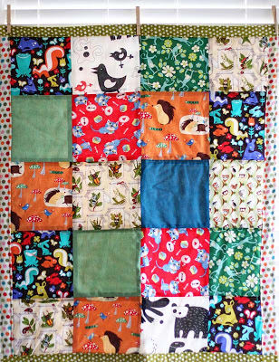
I whipped up another mini-quilt, for a friend who is a Biology professor. Of the evolution/ecology sort, not the molecular/genetic sort, so I made sure to include lots of animals. Not that I'd not include animals in quilts for babies produced by non Biology professor parents. My favorite fabric is the (anatomically correct) bugs-in-jars print. I found it online and was so delighted, I bought piles of it before I knew what to do with it.

May I make a small digression - so often, ants are drawn incorrectly. I'm not saying that all ant drawings should be scientific illustrations. But a basic basic detail is always misrepresented: antennae are attached UNDER the eyes of an ant face; ie, if you were an ant, your antennae would sprout perhaps halfway between the inner corner of your eye and nostril. Maybe at highest Next to the eye, but certainly not on the Forehead, like so many cartoons shamelessly depict. I'm only really picky about ants (which by the way, are all female - you'd pretty much never see males, so Bug's Life? Antz? All wrong, all wrong!). Other animals can be misrepresented.

I learn a little more with each quilt I make. I thought I had everything figured out, but then the last column of squares turned out skinnier than the others. Alas! I will know better next time. And maybe, I will graduate to include triangles shaped fabric pieces in my quilts.

In the same way that I look at amateur photos and automatically think: what a cliche composition! look at that dusty lens! the white balance is off! it's not even focused! I'm sure an experienced quilter looks at my quilts and thinks: the squares aren't square! how boring a pattern! the edging isn't straight or even! what a hodgepodge of colors! the thread knots are visible!

With A Little Bit O' Bloomin' Luck (Quick Name That Musical!)

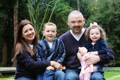
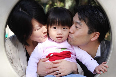
This family photo is deceptive. It looks straight forward. Standard composition, nothing fancy about it. You'd never guess that it took seven moons aligning, a shot of liquid luck and a dousing of faerie dust to get everyone (pretty much) looking at the camera, smiling, not blinking. This is how it is with kids between 2 and 5.

You take what you can get... even if the lighting isn't right or the background is distracting... if the kids calm down enough to be still for 2 seconds and smile, I take the opportunity, because it's unlikely to happen again! And the Musical? My Fair Lady of course.

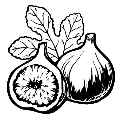
Figs.

I must accept that I don't have time to color, not now. The remainder of the restaurant items are due in a week, and I need to churn them out. I am still struggling with shading - it is far more time consuming than drawing and inking the outline. I fear I am shifting slightly to comic art style shading instead of wood cut style.

By the way, if you scroll down to the Peaches, and the Pomegranates, you'll see that these fruit as well as Figs are placed in a Triangle Composition. It's a straight forward and pleasing yet visually interesting set up. One can do the same with faces in a photo.

Flecking and Spritzing and Radiolab


I know I've said it before but let me reiterate... digital coloring is an absolute delight! With much glee, I flecked each pomegranate seed with a dash of white, rendering them luscious. I spritzed the fruit skin with fine speckles and gently scratched the surface with a rough brush.

While I draw, color or edit, I listen to a lot of podcasts. In this case, I listened to a few episodes of Radiolab (by WNYC), which has excellently edited, thought provoking and humorously presented programs about questions in science. I recommend it, especially if you have geeky tendencies:
http://www.wnyc.org/shows/radiolab/

Third Person

In many ways, a maternity photo shoot is like a couple portrait session. But with an extra person. In an engagement shoot, I might crop closely to the faces, but if I do that with a couple in a maternity shoot, we miss the whole point. The pregnant belly becomes an essential feature of the photo, as important as the couple's heads, and I design my compositions while keeping this in mind. For example, I would never crop through the belly, as I wouldn't crop through the middle of a face. The belly shouldn't feel "left out" of the photo, any more than one would place a baby off to the side of his/her parents. I try to involve the belly, with placement of hands or directed gazes.

This couple was interested in something different from a nature-y background, so we went to the Baker Beach barracks - old concrete forts and former homes to canons, in the olden days when defense was focused on attack via ocean. It is full of precarious stairways, locked doors and eroded, stained walls, all features that are fun for photographers! It was fun to contrast soft curves and lovey looks with this surreal landscape.


My listing is finally posted under Tiny Prints Photographer Favorites! http://www.tinyprints.com/tiny-prints-local-photographer-recommendations.htm
I'm very pleased with this, and the news has kicked up my Day Quality by a couple of notches. I don't think that many people actually refer to this resource page when looking for a photog, as presumably if they go to TinyPrints they already have photos ready to print. But... that's OK!

Monday Mumbling

Good morning! Yawn! It's Monday, but it's the equivalent of my Friday, as I was shooting through the weekend and the days before the weekend. I've got more canned fruit company head shots to do this afternoon, and I will know better than to haul all my equipment out there.

Weather has been very inconveniencing in the last month. I've had to postpone multiple shoots due to rain, and have had some clients postpone due to family members stuck out on the East Coast due to snow. It looks like rain for this weekend too, which means rescheduling a handful of families. I pretty much memorize the weather forecast for the the week ahead, on any given day.

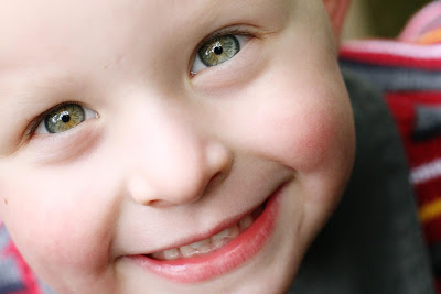
Anyways, I'm posting a pic of a bright eyed and presumably bushy tailed little munchkin. He embodies the exact opposite of what I'm feeling at the moment!

Peaches For Me


I did those Non-Scary-Natural-Light exec head shots for a certain large canned fruit company today. The one with more syllables. Why so cryptic? Just for fun. Anyways, they're located at One Market St in SF, which is amazing real estate because it's right there where Market T-intersects with Embarcadero. Views of the Bay Bridge and such. How did I get this gig? Just so happened that I did family photos a the human resources person in that company. They did consider several candidates, and it came down to myself and another with a similar style and rate, but they had met me and not the other photographer, so the choice was easy. The power of referral.

I hauled about 40 lb of equipment over there, mostly lighting stuff. Just in case I had to do an indoor shoot. I was brought up to the lunchroom, which opens onto the shaded (by other tall buildings) rooftop. The roof had a wall decorated with a wooden lattice and leafy vines strung throughout - this was to be the backdrop. It was a partly cloudy day, and I wound up using all natural light, about 2 lb of the 30 lb of stuff I'd brought along. Suited men and woman showed up, stood in front of the lattice, smiled, and left. It was remarkably straight forward.

I lightened my load as I ate parts of it for lunch, but my load reducing efforts were thwarted, at the same time my secret hopes had been fulfilled. She walked in, carrying two boxes full of cling peaches and bartlett pears in jars, spotted me and asked cheerfully: Want some peaches? They're almost expired... I can't serve them at meetings any more.
Free Fruit?! Yes Please!
I shall never grow out of undergrad free food mentality.

And it just so happens that I am drawing peaches for this restaurant illustration gig.

Everything is More Fun With Bubbles

When you've got bubbles, the possibilities are endless. However the facial expressions are rather limited to the pursed lips look. It is one of those lovely coincidences that the large bubble happened to float by her eye when I took this photo. I must be in a website refreshing mode - the above photo is now the first pic in my "grown ups" section. I took these at an engagement shoot in January. We did of course, do non-bubble photos additionally, but these are the most fun. I encourage props!


Diggin' In The Archives

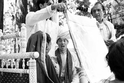
I've been digging around in my 2TB external hard drive for old photos. Yep, TB - that's terabyte. I didn't even know that existed before I went hard drive shopping last year. I remember way back when it was amazing to have 2 gigs of hard drive space. 1 TB = 1000 GB, which is unfathomable to me. Anyways, TinyPrints decided they wanted some Indian Wedding photos, from Aug 2009. They are interested in a bride photo, but I pulled out some groom ones to blog. Not really based on anything except that they happen to be in B&W.


I realize, I have piles and piles and piles of unposted photos that totally deserve to be posted. My blog has the freshest content... and the least quality control which makes upkeep easy. Only the best pics go on the website - that's relatively easy to decide. My poor FaceBook biz page is languishing from neglect. Partly because I don't expect to gain business from having a page on FB. Partly because I feel like I ought to post a whole album of 20+ good quality pics at once, of cohesive theme. Time consuming.


He's not truly horrified to see his future wife once the sheet between them has been removed. But I'm glad I caught the moment!

Puppy Delight.

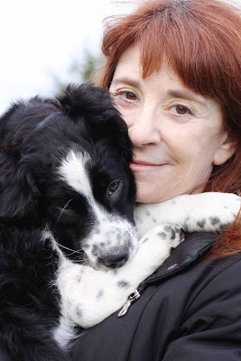
They grow up so quickly! In many ways, a puppy shoot is like a baby shoot. Doting parents. Toys required for capturing attention. Floppy bodies. Quickness to tire. No bodily function control. Edible or not, everything goes in mouth. And cute cute cuteness!

Samantha is already a big puppy, a jumble of gumby-like limbs that wind up pointing every which way without a hint of discomfort. She is astonishingly flexible, very much a pile of invertebrate puppy - any way you hold her she settles into a soft round mass of wriggly delight - then suddenly she becomes sleepy, and seems happy to fall asleep in just about any position too. Ah puppies!!!

Tis the Season for Cherry Blossoms

For the longest time, my website splash page photo featured the family of three amongst tall grasses, the parents looking fondly at their daughter, the little girl clutching a flower and looking at the camera. As I was editing GinkgoPhotothon pics today, I came to this photo. And I had a Wow, Did I Take That? Moment. This is now my splash page photo.

It isn't perfect. The major fault is that a blossom branch runs almost straight down the middle of the photo. I could crop the pic I suppose, so that the branch is no longer centered, but I didn't want to cut out any more the raining blossom branches. I think the environment the blossoms create outweighs the compositional discomfort of that central branch. Also, the asymmetry of the girl and the tree trunk help balance that out. Here presence is much greater than the branch, and you notice her first.

More TinyPrints news. I'm enjoying being an insider in the industry, even if I only have a pinky toenail on the inside. It seems they are expanding their service to cover teen events, as well as babies and kids, and are thus specifically looking for photos of teens to use in their sample cards. Apparently, teen boy photos are the most challenging to get a hold of. So, they gave me a list of photos they'd like to use, and most of the requests are of teens, and a few are of my signature baby and family photos. Next step is for me to contact the parents, and ask if they'll let TP use the pics.

In other news, I received my new postcards. They printed out a bit dark, with a slight blue-ish hue. The warmer colored photos look OK, but those taken in a whiter light - ARGH, the subjects look a little blue and, well, zombie-ish. Just slightly. A not altogether healthy pallor. I gave one to the UPS guy who delivered the box of 250 postcards to me, and he thought it looked great, so maybe it's just my critical eye. Well, at least this way I won't feel stingy (and I mean as in Wanting To Keep Them All, not as in Bee Sting - you'd think these would be spelled differently) about leaving piles of cards here and there, to use em up.

And finally - remember those corporate head shots I was fretting about? I need not fret, because they actually want "natural" looking head shots, in front of shrubbery, in natural light. That's why they chose me. Well, that all makes a lot of sense.

Bangs.

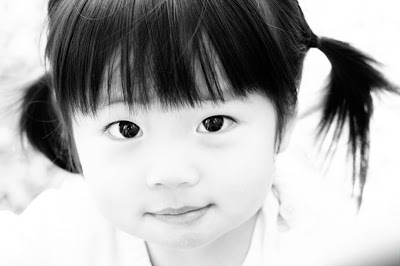
Had the first photo been a planned photo, I would've included more of her bangs. But as with much kid photography, it's a matter of being opportunistic and quick on the reflexes. Hmm. Not much commentary for you today. I have a cold and my brain is dull, so I give you some lovely GinkgoPhotothon photos to make your visit worthwhile.


Red Sweaters


My GinkgoPhotothon Fundraiser for Haiti raised $1005 for Doctors without Borders. Around the same time I was photothoning, the local news reported a Bay Area cafe that had donated a day's worth of sales to Haiti relief. They raised $1000, and received loads of publicity! Next time I ought to tip myself off to the media.

I had a lot of fun photographing these brothers for the photothon. They were up for doing anything for the camera, as long as it was silly.

Beets Vs Radish

My restaurant contact asked me if there were any vegetables I wanted to draw. My favorite vegetable will be coming up soon, but 2nd, I listed beets, for their shape and color. I could have suggested radish, but I like borsch, so beets it was. The difference between them? Beets are kind of sweet, radishes are spicy. Cut a beet and inside will be vivid reddish/purple/magenta. The inside of a radish is white. I think beets can be more irregular shaped (though mine are nicely spherical here) than radishes, which are smoother. Also their leaves are completely different, something I learned when researching images for this illustration.